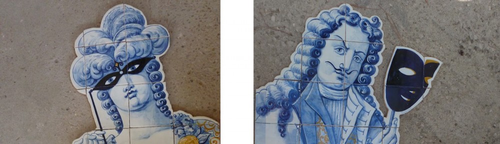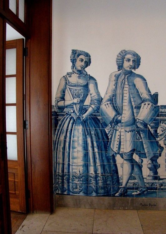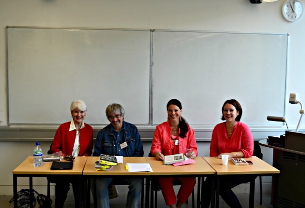
Patricia O’Reilly (far left), Michael Dean, Stephanie Renee dos Santos, Alicia Foster
Art and artists stories of bygone days transport us, prompt us to ask questions, to wonder, and to explore the time and places and enigmatic figures whose creations line museum walls and podiums today. Who were these creatives that’ve blessed the world with their enduring artistic visions and awe-inspiring works? What are the life stories inside and behind the glossy varnishes and layers of paint and glaze? What provoked an artist or group of artists to conceive of such masterful pieces? These are a few of the pertinent questions to ask and investigate when interested in writing historical fiction about art and artists.
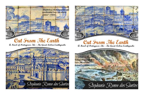
 At the London 2014 Historical Novel Society Conference, writers of art-based historical fiction Patricia O’Reilly (The Interview,Time & Destiny, A Type of Beauty: the story of Kathleen Newton), Michael Dean (I, Hogarth, The Crooked Cross, Hour Zero, Thorn), myself (working title Cut From the Earth), and Alicia Foster (Warpaint) came together to discuss some key points to consider when writing about art and artists.
The points we addressed:
-Seeing and thinking through the eyes and heart of the artist
-How much artistic ‘process’ to reveal in scenes – when is enough enough?
The points we didn’t have time to thoroughly discuss:
-Use of artist spaces to depict action in story – moments of crisis and conflict
-Using specific artworks to reveal time period and/or social/political attitudes – to depict an art history advancement.
The Panel-Talk
Stephanie Renee dos Santos: Beginning with the panel-talk’s first discussion point — seeing and thinking through the eyes and heart of the artist — Michael Dean began our talk referencing his recent release I, Hogarth.
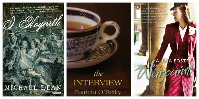
Michael Dean: I have written four novels that deal with art: I, Hogarth, The Crooked Cross, Hour Zero and Thorn. I, Hogarth tells the story of an artist from the moment of his birth to the moment of his death from inside his head. It blends Hogarth’s life and his art into one narrative – so sometimes the story of his life is what happens in his paintings. I, Hogarth also blends the style and the content, so it’s not my voice and not my writing style. It’s Hogarth’s voice speaking in Hogarth’s style, reflecting Hogarth’s character. In the scene I am about to read from, Hogarth is a very young man, early twenties. He is about to marry his beloved Jane Thornhill, who is a barely legal sixteen.They have eloped and are marrying against the wishes of Jane’s famous painter father James Thornhill. They get to the church and find another couple being married ahead of them.
This is Hogarth’s view of what he saw.
“The bride was an ancient crone in a thick ivory-white girl’s wedding dress and strange white chapeau arrangement dangling off her head, a thin-lipped smile of triumph masking a lack of teeth, and her wrinkled, flat breasts peeping out, like antique water gourds; half empty now but still strapped to the saddle after a long horse ride.
Also, she lacked the full complement of eyes, the poor dear, having only the one. This facilitated the groom’s gazing at the girl’s pretty maid, as she adjusted the ancient’s dress, on her blind side. This damsel bride was old enough to be the groom’s grandmother, but, I would have hazarded, rich.
Conducting the ceremony, the Reverend Winter cast a glance our way, but the words gurgled on. In fact, it occurred to me that if the Reverend Winter did not speed up somewhat, he would have to proceed seamlessly to the funeral service, as the bride looked ready to expire.”
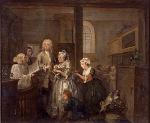
The Marriage
SRDS: The passage brings to life in prose the visual story depicted in Hogarth’s painting “A Rake’s Progress V”, “The Marriage”, showing Hogarth’s youth, happiness and iconoclasm. Notice how Dean depicts what the artist sees, “…thick ivory-white girl’s wedding dress…flat breasts peeping…”. While Alicia Foster elucidated this point with an excerpt from her novel Warpaint that features four WWII female artists working from two different angles to aid the war effort: the black propaganda side scheming against the enemy, and the home front artists with the task to rally the bull-dog spirit of the British populace.
Alicia Foster: [This is from the point of view of character Vivienne who works for the covert black propaganda front.]
“A picture of the drawing Vivienne had finished that day came into her head, the design of a salacious cartoon to be printed on several thousand ‘greetings cards’ and dropped upon occupied Greece. The Greeks were being starved to death by their German invaders, and any protesters shot without ceremony. Black was trying to help loosen Wehrmacht fingers from their rifles. The German soldiers would, hopefully, stop to pick up the cards because Vivienne’s drawing would bring thoughts of sex to them, fluttering miraculously down from the sky: for a moment they could remember and imagine, escape from death, hunger, dirt and fatigue. But the lust would quickly turn – because of the details of the drawing – into fear as to what might be happening back at home, and they would find it difficult to fire with the same zeal. Or that was the idea, anyway.
To attract as many as possible, the ‘cards’ must fall from the plane like a shower of obscene confetti: their size, and the amount of printer’s ink used, had to be carefully controlled so that they remained light. Yet the drawing was complicated: it had to show a foreign interloper (swarthy of skin, large-nosed,obviously not a son of the Reich) taking advantage of a buxom young Hausfrau whileher husband was away serving at the front. The couple had to be entangled in a position in which you could see, immediately, what they were up to, but also exactly who they were. This was where it became tricky. Clothes were important, and the figures couldn’t be lying down, as one of them would be half-hidden.So, then, stand them up, problem solved. But how? A side view would be best, you could see both of them clearly. The setting had been obvious to Vivienne: it had to be the kitchen, the very heart of the home that the soldier husband was away fighting for. But then there was another problem: what should she include to indicate a kitchen, while not crowding out the central characters? Here, Vivienne had a moment of inspiration, remembering the Rowlandson prints thathung in their bedroom – tarts and lechers pictured in graphic detail using only line and a limited range of colours. Of course Vivienne couldn’t mimic the subtlety of his draughtsmanship and tone, not with the crude stuff she had to work with, but then there was to be no subtlety about her design.
Against a yellow background, strong enough to catch and hold the glare of the Greek sun, Vivienne had outlined in black a stove with bubbling saucepans and a window with flowery curtains. A cat and a crying baby in a highchair (why not go the whole way?) were sketched in to either side of the lovers. A framed portrait of Hitler hung above them. And how the pair filled the space! Drawn in heavier black, the girl had been pushed over the kitchen table, her thick pigtails swinging with the movement, with at each end a pink bow, to match the colour of her mouth in an O of surprise and of her round doll cheeks, and then carrying the eye down to his cock, in the same colour (Vivienne made a tacit acknowledgement to Rowlandson: he knew how to draw these things clearly). Her laced bodice was black, also her dirndl skirt; you took in her arched body straight away, and could see her skirt had been pulled right up over her waist. His clothes – a scumble of greenish grey –stood out against the yellow kitchen.”
SRDS: Again, through this passage Foster like Dean takes the reader into the visual mind and shows us what this unique, specific artist thinks, imagines, is concerned about, and in this case, trying to achieve through her art. Where as I shared these two quotes to highlight how tile maker protagonist, Piloto, in my work-in-progress Cut From the Earth views his world…
 “Piloto paused and admired the red geraniums of the yard and the surrounding hillside’s vineyard grape leaves turning from saffron to the color of claret wine.”
and
“Clasping the rosary’s cruciform, he glanced at the blue and white tile he’d made for his mother prior to her death. The tile called to him. He took it and swiftly admired its design, turning it over, and held it up to his nose inhaling its earth scent. Images of the varved clay deposit appeared before his eyes.”
What’s important in each of these clips is you are seeing what is important to the artist, the color and changing hues that surround his world, the remembrance of an earth smell first that still imbues the tile he’d given to his mother, and then a visual image of where the clay came from to make the tile. Artist notice everyday details that other characters may not give any attention to in fiction.
Patricia O’Reilly: Artists, their thoughts and their work process are integral to my historical fiction titles Time & Destiny, A Type of Beauty, the story of Kathleen Newton and The Interview. For the Historical Novel Society Conference panel-talk, my focus was on art and the artist in The Interview.
The prime character in The Interview is Irish designer and architect Eileen Gray (1878-1976). The works she is best known for are: The Destiny Screen (which earned her international fame in 1913 and again in 1972), apartment at rue de Lota (which brought photographers and journalists from America), and E.1027 (regarded as one of the most iconic houses of the 20th century).
Every fiber of Gray’s being was devoted to art – even when she was in the throes of her passionate love affair with nightclub singer Damia: despite being out at clubs until the small hours, she rose early to work at her drawing board. After WW 2 she returned to Paris, lived on a diet of potatoes and designed by candlelight.
Gray’s art embraced lacquer work, painting, photography and architecture. My research confirmed that it was harder for women artists to make a name for themselves and that they are undervalued in art history. Eileen Gray was no exception – to the extent that knowing the resistance to business women she named her gallery Jean Désért (a common first name in France and Désért for her experience of sleeping in the desert).
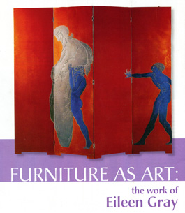
The passage below from The Interview shows Gray in artistic action on The Destiny Screen, and the second paragraph the effect the creation has on her.
“When she transferred the silhouettes of her three male figures from paper to screen, the colours evolved in a trance-like state of certainty that left her in no doubt. The background was a burnt orange-red of mysterious shadings and shadows; the corpse was a muted grey; the other two figures were a rich blue. She finished the front of the screen by highlighting the figures with the merest shiver of silver; on the reverse side she created an abstract composition of vigorous swirls.
Hers was a project slow in execution and long in creation but one which gave her the greatest of pleasures. Sometimes during the small hours of the night, alone in her workroom, lacking sleep, eyes blurring and focusing with difficulty, sustaining herself on squares of chocolate and cigarettes, it felt as if this screen was her life’s purpose, as though from birth this had been mapped out as her destiny.”
SRDS: This is yet another excellent example of the artist’s mind and heart at work as she reflects back on one of her greatest and most famous work the lacquer screen “Le Destin”, “The Destiny Screen”.
This concludes this post “Part 1: Review of panel-talk ‘Art and Artists in Historical Fiction: The special challenges of writing about art and artists'”. Next month I’ll post Part 2 of this recap, addressing the second question we discussed at the 2014 London Historical Novel Society Conference: How much artistic ‘process’ to reveal in scenes – when is enough enough?
Stay tuned!
‘